A bubble chart is simply a scatterplot with the added feature that point sizes are proportional to the values of a third quantitative variable.
Here is an example. Using the mtcars dataset, we’ll plot car weight vs. mileage and use point size to represent horsepower. We’ll use the ggplot2 package and rely on the defaults.
# create a bubble plot
data(mtcars)
library(ggplot2)
ggplot(mtcars,
       aes(x = wt, y = mpg, size = hp)) +
  geom_point()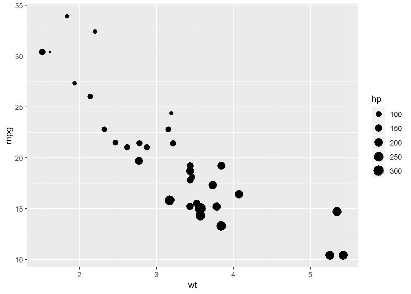
Figure 1: Basic bubble plot
While useful, we can improve on the default appearance by
- increasing the size of the bubbles
- choosing a different point shape and color
- adding some transparency, and
- including more useful labels.
# create an improved bubble plot
ggplot(mtcars,
       aes(x = wt, y = mpg, size = hp)) +
  geom_point(alpha = .5,
             fill = "cornflowerblue",
             color = "black",
             shape = 21) +
  scale_size_continuous(range = c(1, 14)) +
  labs(title = "Auto mileage by weight and horsepower",
       subtitle = "Motor Trend US Magazine (1973-74 models)",
       x = "Weight (1000 lbs)",
       y = "Miles/(US) gallon",
size = "Gross\nhorsepower") 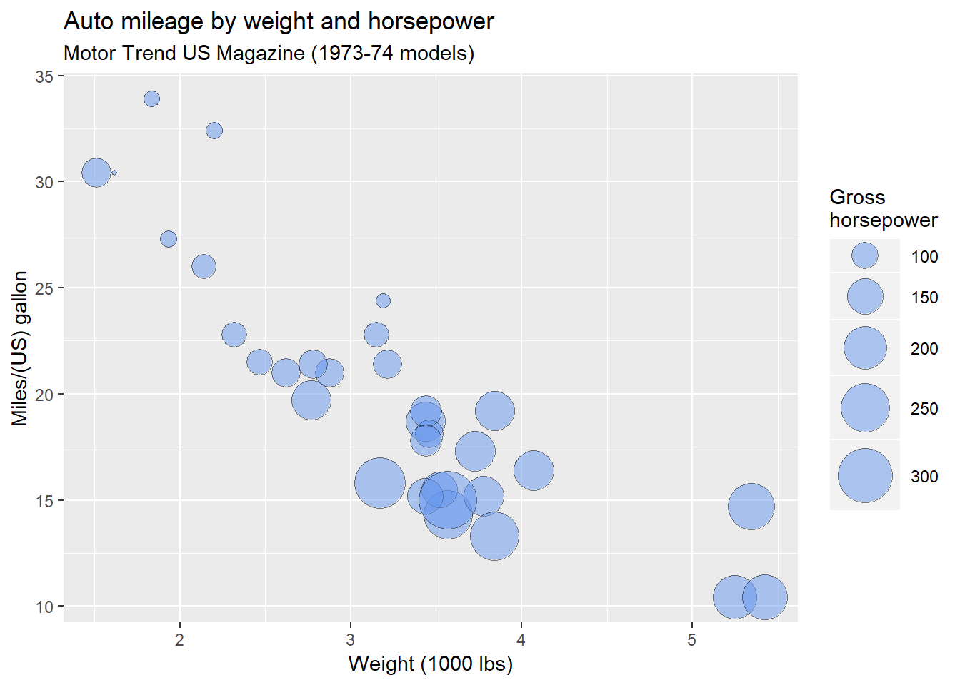
Figure 2: An improved bubble plot
Here are some things to note:
The
rangeparameter in thescale_size_continuousfunction specifies the minimum and maximum size of the plotting symbol. The default isrange = c(1, 6). A larger range will magnify size differences.The
shapeoption in thegeom_pointfunction specifies a circle with a border color and fill color (shape = 21).Labels should include units of measurement whenever possible. Also note the use of
\nto produce a line break in the horsepower label.
Clearly, miles per gallon decreases with increased car weight and horsepower. However, there is one car with low weight, high horsepower, and high gas mileage. Going back to the data, it’s the Lotus Europa.
Using Color
We can add a fourth variable to the plot by mapping its values to the bubble fill color. For example, let’s add the number of a car’s cylinders to the plot above.
# create an improved bubble plot using fill color to represent
# a fourth variable
ggplot(mtcars,
       aes(x = wt, y = mpg, size = hp, fill=factor(cyl))) +
  geom_point(alpha = .5,
             color = "black",
             shape = 21) +
  scale_size_continuous(range = c(1, 14)) +
  labs(title = "Auto mileage by weight and horsepower",
       subtitle = "Motor Trend US Magazine (1973-74 models)",
       x = "Weight (1000 lbs)",
       y = "Miles/(US) gallon",
       size = "Gross\nhorsepower",
       fill = "Cylinders") +
theme_minimal() 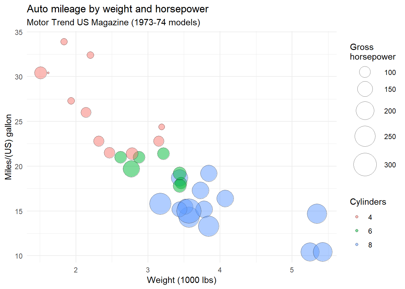
Figure 3: Adding color to a bubble plot
I’ve found that mapping a variable to a fill color works best for factors (representing categorical variables). Often mapping quantitative variables to fill colors leads to smooth color gradations with color variations that are difficult to distinguish.
In the above graph, a minimal theme was used. This is a personal aethetic choice.
Interactive Bubble Plots
So far, the plot is static. We can use a package such at plotly to render an interactive bubble plot. Mouse over the points to see the effects.
# create an interactive bubble plot
library(plotly)

mtcars$cyl <- factor(mtcars$cyl,
                     labels=c("4 cyl", "6 cyl", "8 cyl"))

plot_ly(mtcars, x = ~wt, y = ~mpg,
        size = ~hp, color = ~cyl,
        type = "scatter", mode = "markers",
        marker = list(opacity = 0.5, sizemode = "diameter"),
        text = ~paste(row.names(mtcars),
                      "<br>horsepower:", hp)) %>%
  layout(title = "Auto mileage by weight, horsepower, and number of cylinders",
         xaxis = list(title = "Weight (1000 lbs)"),
         yaxis = list(title = "Miles/(US) gallon"))
You can create much more customized interactive bubble plots with plotly. This help page provides details and examples.
You can freely create interactive Plotly graphs on your desktop for local use. However, if you want to post the graph on a webpage, you’ll need to use the Plotly API. There are three steps in this process:
Obtain a free account on Plotly (https://plot.ly) and record your username and and api key. This will allow you to post 25 graphs for free (with 500 embedded views per 24 hour period).
Execute the following code in the R console (inserting your actual username and api key for the placeholders). Alternatively, you can place the commands in your
.Rprofile(a file that is executed every time you start R).
Sys.setenv("plotly_username"="your_plotly_username")
Sys.setenv("plotly_api_key"="your_api_key")- Use the following code to generate the graph.
# create an interactive bubble plot for placement on webpage
mtcars$cyl <- factor(mtcars$cyl,
                     labels=c("4 cyl", "6 cyl", "8 cyl"))

p <- plot_ly(mtcars, x = ~wt, y = ~mpg,
             size = ~hp, color = ~cyl,
             type = "scatter", mode = "markers",
             marker = list(opacity = 0.5, sizemode = "diameter"),
             text = ~paste(row.names(mtcars),
                           "<br>horsepower:", hp)) %>%
  layout(title = "Auto mileage by weight, horsepower, and number of cylinders",
         xaxis = list(title = "Weight (1000 lbs)"),
         yaxis = list(title = "Miles/(US) gallon"))

chart_link <- api_create(p, filename = "bubble-chart")
chart_link
Simply place this code in an R chunk in your Rmarkdown document.
Final Notes
Bubble charts are controversial for the same reason that pie charts are controversial. People are better at judging length than volume. However, they are quite popular and their use is growing.
This post is adapted from Data Visualization with R, a freely available guide for data visualization.